Design systems / DS-02
Design system for mobile.
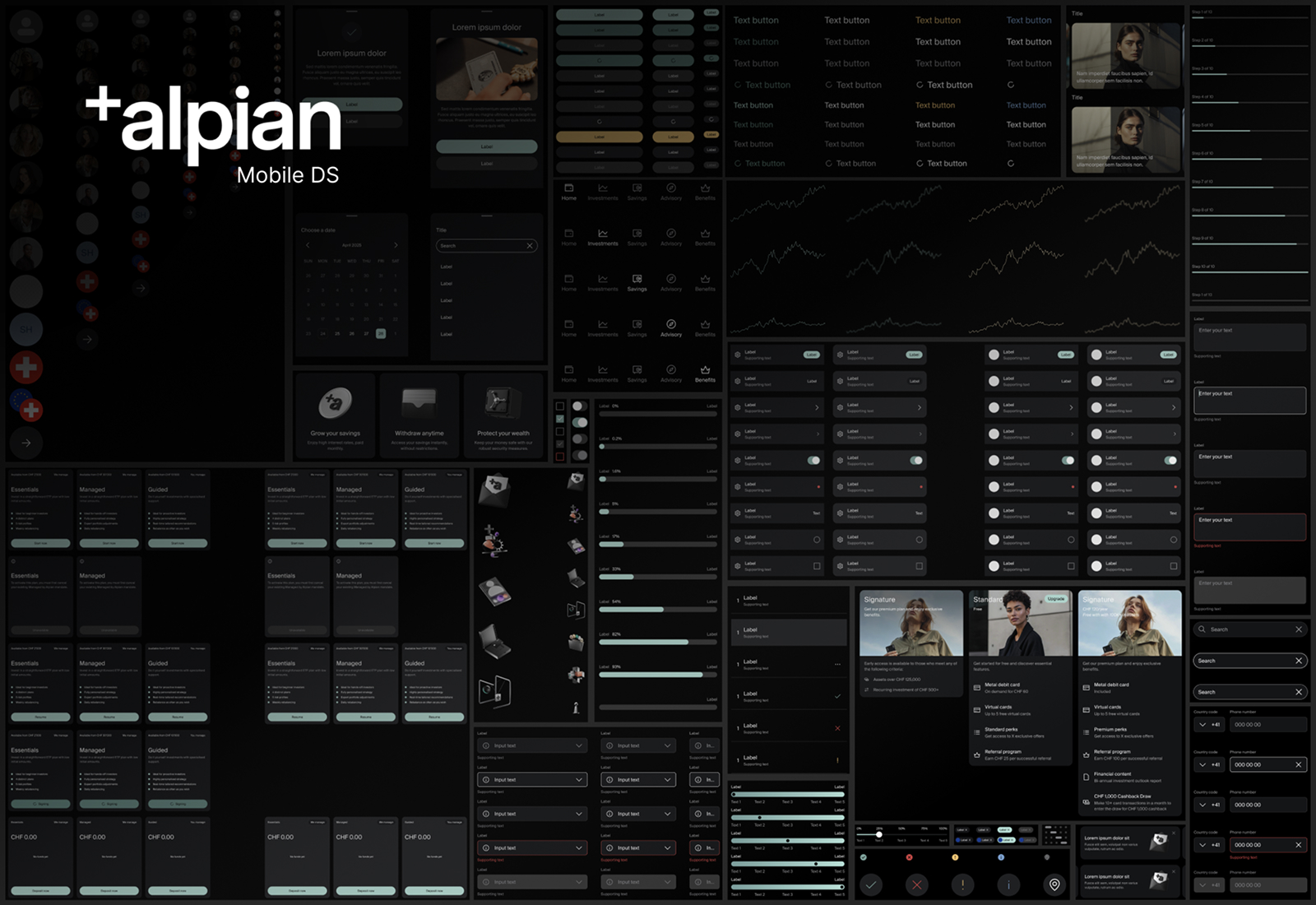
Alpian's app was growing faster than its design language. I led a team of designers to build the system underneath it: researched first, built atom by atom, and run like a product of its own.
01
The brief
Three squads, one app
Alpian is Switzerland's first digital private bank. As the product grew, design split across three squads: everyday banking, investments and advisory. Each squad shipped fast, and each one solved the same problems in its own way.
The result was an app that felt like three apps. My brief was to lead the creation of a design system that every squad would actually want to use, without slowing any of them down.
- Role
- Design lead for the system
- Team
- 5 product designers, iOS and Android leads
- Platforms
- iOS and Android, native
- Timeline
- 2023 – 2024, then ongoing
- Method
- Atomic design, tokens
- Tools
- Figma, Tokens Studio, Jira
02
Research
Research before pixels
Before designing a single component, I wanted to know how people would really use the system. I interviewed every designer and mobile developer, audited the live app screen by screen, and compared how mature systems like Material and Apple's Human Interface Guidelines handle the same problems.
- 12
interviews with designers and developers across the three squads.
- 31
different list items in the app, most of them doing the same job.
- 40%
of each sprint's design time went into recreating things that already existed.
I don't need more components. I need to know which one to use.
Product designer, investments squad03
Structure
Atom by atom
That quote shaped the structure. We organised the system with atomic design, so every piece has one clear place and a clear reason to exist. Small parts combine into bigger ones, and a change to an atom flows up through everything built on it.
We defined the atoms first and agreed on them together, then built up level by level. Nothing moved to the next level until the one below it was stable.
- 48AtomsIcons, labels, avatars
- 120MoleculesInputs, list items
- 160OrganismsCards, nav bars
- 36TemplatesOnboarding, flows
- 400+In totalWith variants
04
Tokens
Dark by default
Alpian's brand is dark and quiet, closer to a private banker's office than a fintech dashboard. We designed dark mode first and treated it as the main theme, not an afterthought. That meant extra care with contrast, elevation and how charts read on a black background.
Tokens connect it all. A single name, like surface-raised, resolves to the right value for each theme and each platform, so iOS and Android stay in sync without anyone copying hex codes.
| Token | Dark | Light | Used for |
|---|---|---|---|
surface-page | #0B0B0B | #F5F5F3 | Screen background |
surface-raised | #1C1D1D | #FFFFFF | Cards, list items |
action-primary | #8FB3A6 | #3F6B5D | Main buttons, progress |
accent-premium | #C9A46A | #9A7638 | Signature plan, rewards |
feedback-error | #E5675C | #C23A2E | Errors, failed payments |
05
Leadership
Built by six designers
I didn't want a system designed by one person and handed to everyone else. Each designer owned part of it, usually the components their squad relied on most. My job was to set the direction, keep decisions consistent and make sure the work moved forward.
Every new component or change followed the same path:
- Propose
- Critique
- Build
- Document
- Release
Weekly system critique
One hour each week where proposals were reviewed together, so decisions were shared and not imposed.
Clear ownership
Every component had an owner, responsible for its documentation and for answering questions about it.
Versions and changelog
Releases were versioned, with a short changelog in Slack so squads always knew what had changed.
Office hours with developers
iOS and Android leads joined every other week to align on naming, behaviour and edge cases.
06
Beyond components
Charts and character
A private bank lives on numbers, so data visualisation became part of the system: line charts, progress bars and allocation views, all with rules for how they behave on small screens and in the dark.
We also built a library of 3D illustrations for empty states and feature highlights. They give the app warmth without competing with the content.
07
Impact
From three apps to one
The system now holds hundreds of components and is the starting point for every new feature at Alpian. Squads still move fast, but now they move in the same direction.
- 31 kinds of list item
- Each squad with its own UI kit
- Dark mode fixed screen by screen
- iOS and Android drifting apart
- One list item, with documented variants
- One shared library for every squad
- Dark-first themes driven by tokens
- Same names and behaviour on both platforms
What I'd do again
Starting with research. The interviews told us what the team needed, and they gave every designer a reason to care about the system before it existed. It never felt like my system: it was ours.