Design systems / DS-01 · Intesa Sanpaolo web
Design System for Web.
Born from the redesign of Fideuram's CRM, this design system grew to serve four web apps at once and is now widely used across Intesa Sanpaolo.
01
Overview
- Client
- Fideuram (Intesa Sanpaolo's private bank)
- Role
- Sole designer and product owner: audit, foundations, components, documentation, Jira tickets
- Scope
- One design system for all current and upcoming web apps for the group's advisors and back office
- Team
- Me and the front-end team
- Year
- 2023
- Tools
- Sketch, then Figma, Jira, Storybook
- Web apps in parallel
- 4+
- Components
- 70+
02
The problem
The starting point
When I started, the first version of the CRM was already live: a basic internal tool with a dated interface. Its only guidelines were a handful of colors from an older web client, and screens were drawn in Sketch from a small UI sticker sheet, not a real component library.
Meanwhile, Fideuram had launched Fideuram Direct, its digital wealth management platform, with a new green brand. The CRM still had the old blue look, so the restyling had three goals:
- Align the CRM with the new Fideuram Direct brand.
- A modern look, without disruption. The old design worked; it needed retouching, clearer rules and attention to detail.
- One design system as the single source of truth for every Fideuram web app.
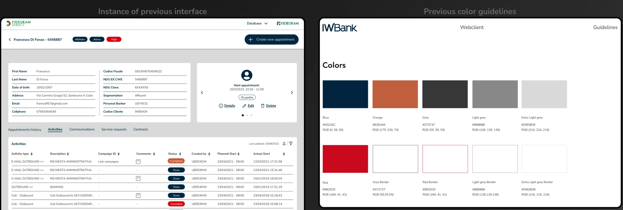
To see the CRM redesign in detail, check out the Rembrandt CRM case study.
At the same time, I was designing three other web apps in parallel, with new, smaller ones appearing along the way. So instead of designing the same elements again for each one, I designed them once, in the CRM, and built them to be reused everywhere.
Before and after
- Before: Sketch, with a small sticker sheet for components and a handful of colors.
- After: Figma with Dev Mode, a library of 70+ components on shared foundations, and Jira tickets to brief developers and track progress.
03
Approach
From one screen to a system
The big work happened on the CRM. I rebuilt one existing screen exactly as it was, turned its elements into components, and only then started improving them, one layer at a time.
- Rebuild
Recreate an existing screen as it was, and turn its elements into components.
- Color
Move the primary color from blue to the green of the logo, and build a full scale of shades around it.
- Typography
Keep Nunito Sans, but give every piece of text a place in one hierarchy.
- Iconography
Replace the old, sharp-edged icons with a rounded set.
- Components
Update or create each component, add it to the library, then apply it to the interface. A slow, iterative loop.
- Layout
Study the spacing, so the distances between elements are meaningful and consistent across the product.
04
Foundations
Color, type and icons
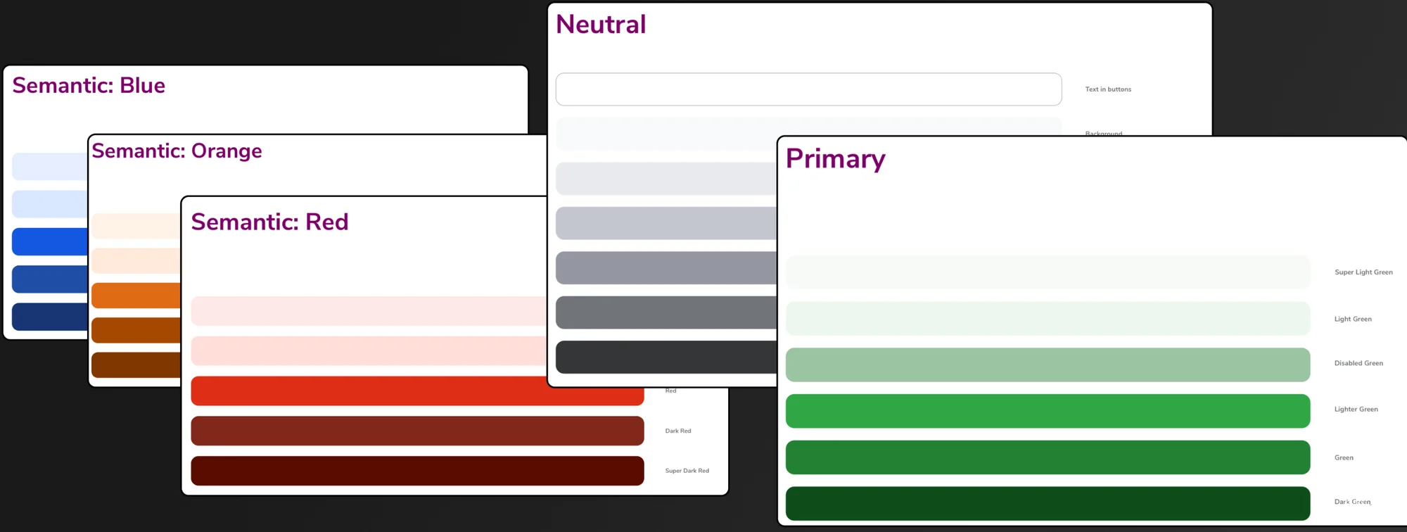
Color came first. The new primary is the green of the Fideuram logo, replacing the old blue, with a scale of shades around it. Next to it sit a neutral scale and three semantic ones: blue, orange and red.
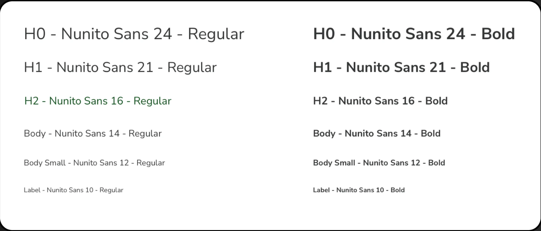
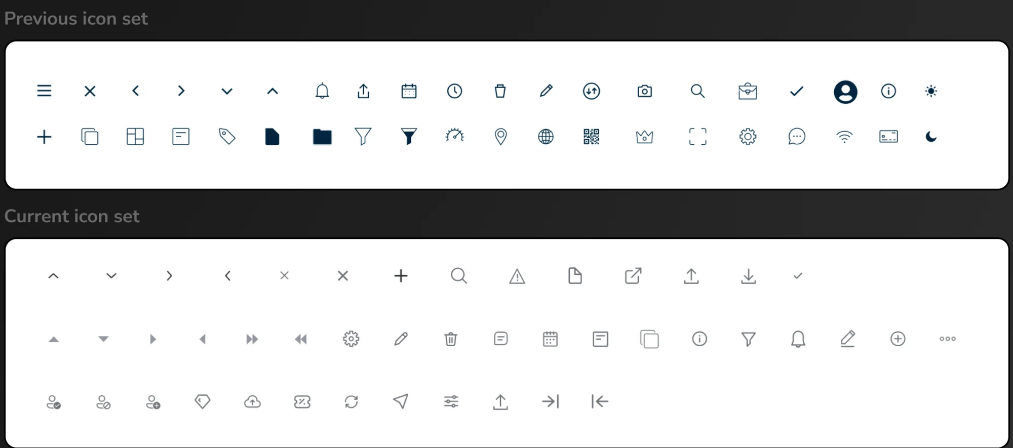
The typeface stayed the same, Nunito Sans, but every piece of text now follows one hierarchy, from H0 at 24 px down to Label at 10 px. The icons moved from a sharp, edgy style to a rounded one that matches the new look.
05
Components
Every state, on paper
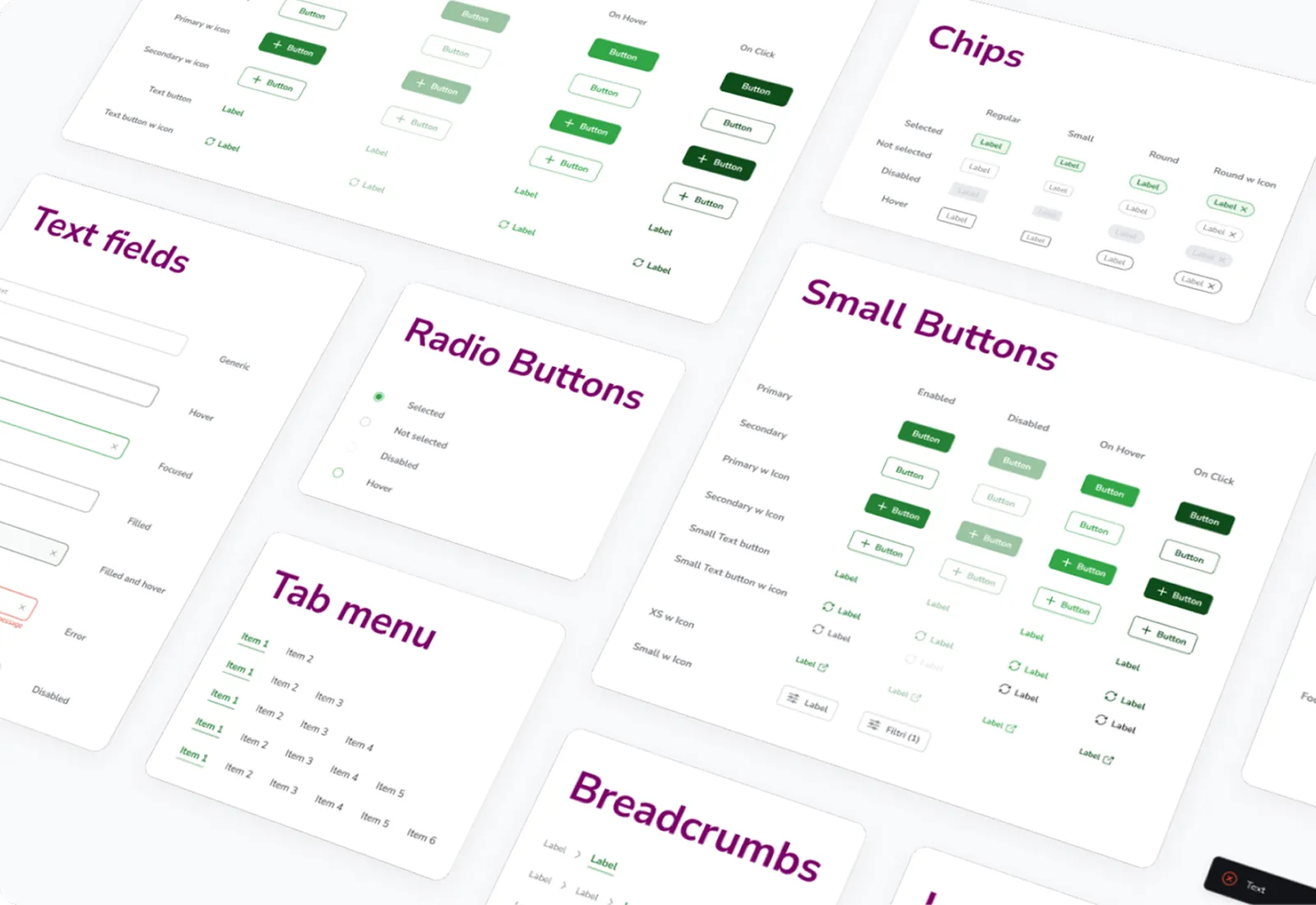
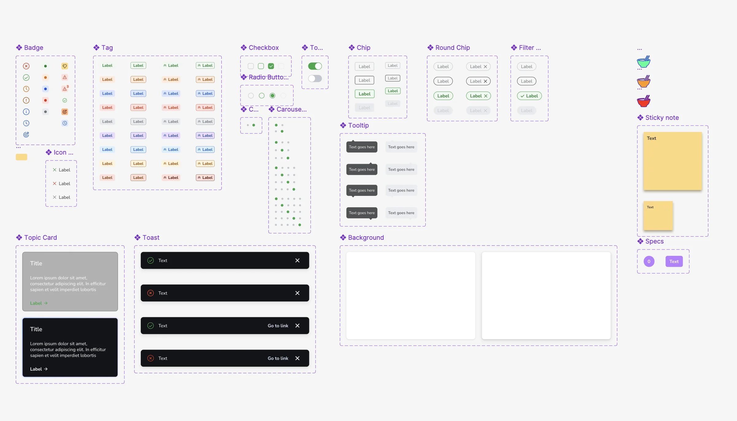
With colors, type and icons in place, I updated the interface component by component. The library grew to more than 70 components, each drawn in its variants and states: enabled, hover, focused, filled, error and disabled, where they apply.
06
Handoff
From ticket to QA
I was also the product owner, so I followed every component from design to production:
- I wrote the Jira tickets, assigned them to the front-end team and tracked progress.
- Developers took specs from Figma Dev Mode, once the library moved from Sketch to Figma.
- The front-end team built the components in Storybook, which I reviewed.
- I ran thorough QA on what was built, and logged every UI mismatch as a bug ticket, so UI debt stayed visible until it was fixed.
The first iteration was ready for development after a couple of months, and was built and completed within 2023. After that, the work never really stopped: QA, maintenance and expansion of the system went on as all four products kept evolving.
07
Outcome
One system, many products
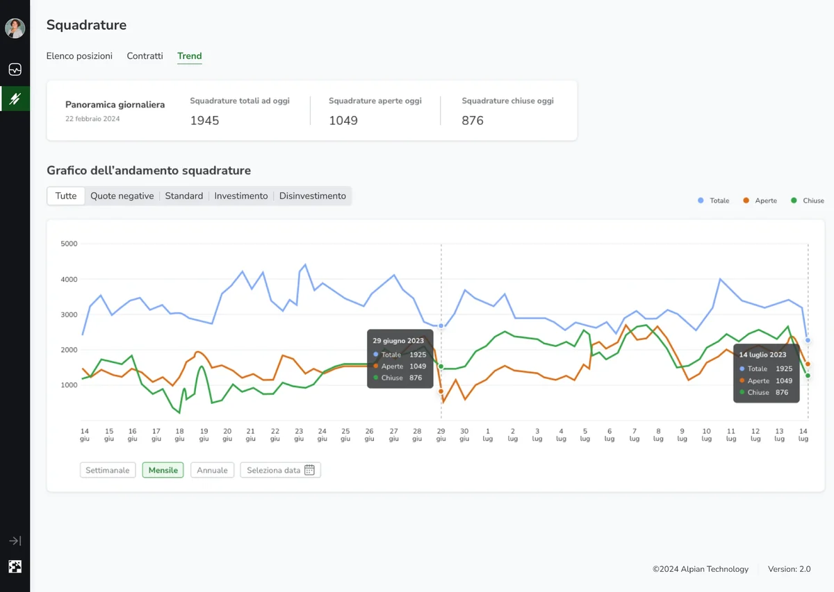
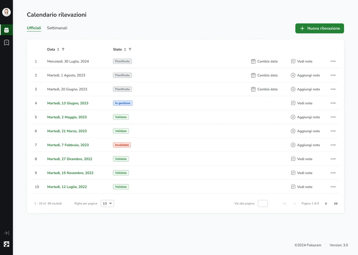
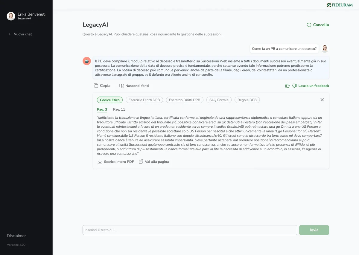
The new version of the CRM was approved by the stakeholders. Then the system went beyond it: Reconciliator, MiaGP and LegacyAI were built from scratch on it, and each one expanded it with its own use cases and requirements.
Today it's widely used across Intesa Sanpaolo.