
Case study
Citty: app and responsive website
01
Project Overview
The problem
Citizens of any age may sometimes feel the urge to change things and make the city they live in a better place, with valuable suggestions on how to improve the situation. But they often have no means to be heard.
The goal
The goal is to build a product for "Social Good". This is achieved through a platform that puts citizens in touch with their municipality and allows them to suggest projects to improve living conditions in their city. Each project will be evaluated and voted, and if approved, a prearranged city budget will be allocated to implement it.
The product
In this project, I will be developing an app and a responsive website for a platform that aims at connecting citizens with each other and their municipality, in order to create a community where everyone can easily put forward suggestions (in the product called “projects”) to improve their city.
Responsibilities
I was in charge of the whole process from start to finish: I conducted a preparatory market and user research and a first set of interviews to identify user personas and user journey maps and to determine the problem statement. I then carried out a competitive audit and used the “Crazy Eights” technique to come up with some ideas for my designs. I finally created lo-fi wireframes and prototypes, tested them and transformed them into mockups and hi-fi prototypes which matched the final version of the product. A last usability test was conducted before bringing a final adjustment to the design.
My role
UX Researcher, UX Designer, UI Designer
Project duration
January 2022 - February 2022

02
Understanding the user
I started off by conducting a foundational research on online material to investigate the market and find potential use for the product. This research confirmed the remarkable value of this idea and brought me to the second phase, which entailed interviewing potential users. I assumed that most adults of any age could benefit from it.
I interviewed a young professional in his 30s and a retired lady. From very different perspectives, they both expressed enthusiasm towards this product and gave me hints on how I could tackle the problem and address their needs.
Now that I've established that the necessity for citizens to get in touch with their municipality is factual, I can move forward and emphatize deeper with the end-users.
Persona & Problem Statement
Persona 1: Ryan
Ryan is a young professional who drives to the office every morning and needs to get in touch with the mayor, because he wants to suggest ways to reduce traffic jams in his city.

Persona 2: Marisa
Marisa is a retired grandmother who lives alone and needs to voice her ideas to her community, because she wants to suggest social activities to increase the quality of life of the elderly residents in her neighborhood.

Competitive audit
While looking for products that put cities in touch with their citizens, I only found three similar cases, all indirect competitors. Only one got close to what I had in mind, nonetheless, I saw there an opportunity to improve the user flow and make the experience seamless.
Ideation
With the benchmark evaluation at hand and the areas of improvement in mind, I am now ready to brainstorm some initial ideas. Since I will be focusing on the dedicated mobile app first, I used the Crazy Eights technique to explore a variety of potential screens for the main user flow.


03
Starting the design
Paper wireframes
The main user flow of the app was first drafted on paper.
This includes eight screens: splash screen, login screen, profile setup, three screens of homepage, project in detail, and submission of a new project.

Digital wireframes
Since the target users of the app include people that are not tech-savvy, a straightforward layout is due. A system of cards, each of which contains a different project to improve the city, will cover the homepage screen.

Usability Study Findings
To prepare for testing, I created a low-fidelity prototype, accessible from here. I used this prototype to conduct a moderated usability study with 5 participants. Here are the main findings uncovered by the usability study:
1. Onboarding
Introductory screens with explanatory text and illustration should facilitate the understanding of the function of the product and its elements.
2. Interface elements
The meaning of the “heart” icon could be confused (does it stand for “like” or “vote”?). It should be replaced by a voting icon. A “star” icon to save favourite projects should also be added.
3. Search functionality
A search bar to explore or find specific projects should be included.
04
Refining the design
Mockups
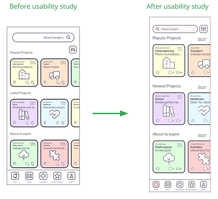
Testing of Hi-Fi prototypes allowed me to hone the design: the initial version presented smaller cards and a slightly different disposition of some elements. Moreover, the navigation bar at the bottom was lacking the "Home" icon. I therefore added it I by replacing the "Notification" icon, whose functionality is now integrated in the "Profile" icon.
Illustrations play an essential role in guiding the user through the app and making them understand how it works. Visuals had to be improved significantly.

Refined designs

High-fidelity prototype
The high-fidelity prototype included the design changes made after the usability study.
Main user flow: from onboarding screens through the creation of a new project + project screen + menu screen
View the Citty App high-fidelity prototype here.
Accessibility considerations
1. Guidance
This product has been designed for people of all ages. Less tech-savvy users are guided through the product with the help of illustrations and easy-to-understand vocabulary.
2. Languages
Multiple languages are available.
3. Visuals
Good contrast ratio and big-sized text, components and images will help those with visual impairment.

05
Responsive Design
After completing the first iteration of the mobile app, I focused on adapting its design to the web versions. In this case, I used the “mobile first” approach: I designed the mobile website first, and the desktop version after, thus optimising the designs for each type of device and screen size, and their different user base.

.png)
App
Mobile
Desktop
Sitemap
The Information Architecture of the website presents both a hierarchical structure (different pages at the same level and parent/child relationship) and a sequential structure (for the new-project-creation process).

High-fidelity prototype: responsive mobile
Main user flow: from the homepage through the creation of a new project + projects page + menu screen
View the Citty responsive website high-fidelity prototype

High-fidelity prototype: desktop website
Main user flow: from the homepage through the creation of a new project + projects page
View the Citty desktop website high-fidelity prototype

06
Iteration and UI exploration
Further tests and visual improvements on the app
Upon completing a first iteration of the app, further testing showed that more fixing was needed, particularly on the UI.
The app saw a restyling of some core elements, like the project cards. Keeping the same functionality, I streamlined the design making information more legible.
The project page is core to this app, since it’s where users can vote and comment on others' projects. The interface needed the call-to-actions to stand out more and be more relevant to the cause.


An interactive prototype of this new version is available here.
Visual design experiments
To investigate the potential of white labeling for Citty, I crafted three additional versions of the homepage, each tailored with a distinct design language intended for specific target audiences.

Fun and young

Modern

Corporate
07
Going forward
Takeaways
Impact
After a last iteration of testing, the app received a very positive feedback.
Three quotes from the users:
“I love the concept of this app, because I would finally be able to reach out to the people in charge and suggest ways to make my town a better place.”
“It’s a remarkable idea and a well crafted product. Very easy to use and straight to the point. I feel my voice can finally be heard by my community. I feel less lonely.”
“This app takes democracy to the next level.”
What I learned
The urge for people to be heard is real. Citizens could now speak to their community through this app, and the city administration would be able to make choices based on what its people really need and ask for.
Next steps
1. Promotion
Convince cities to adopt this product.
2. Admin dashboard
Develop the admin dashboard for the back office.
3. Further research
Launch the product, track the metrics and conduct more user research to determine further adjustments to make.